Showing posts with label graphs. Show all posts
Learning SAS: How to draw simple BAR charts in SAS?
Any data analysis is not complete without visualization and now it's time for us to learn how to draw simple BAR charts in SAS. We've used PROC SGPLOT to illustrate this. SGPLOT works fine in SAS University Edition too.
Output:


Problem 1:
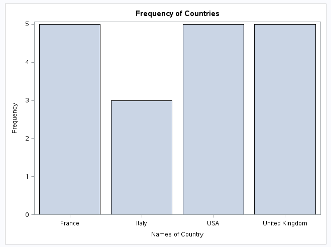
Using the SAS data set Bicycles, produce two vertical bar charts showing frequencies for Country and Model.
Solution:
*Data set BICYCLES;

data A15001.A01_bicycles;
    input Country  & $25. Model    & $14. Manuf    : $10. Units    :   5.
        UnitCost :  comma8.;
    TotalSales=(Units * UnitCost) / 1000;
    format UnitCost TotalSales dollar10.;
    label TotalSales="Sales in Thousands" Manuf="Manufacturer";
    datalines;
USA  Road Bike  Trek 5000 $2,200
USA  Road Bike  Cannondale 2000 $2,100
USA  Mountain Bike  Trek 6000 $1,200
USA  Mountain Bike  Cannondale 4000 $2,700
USA  Hybrid  Trek 4500 $650
France  Road Bike  Trek 3400 $2,500
France  Road Bike  Cannondale 900 $3,700
France  Mountain Bike  Trek 5600 $1,300
France  Mountain Bike  Cannondale  800 $1,899
France  Hybrid  Trek 1100 $540
United Kingdom  Road Bike  Trek 2444 $2,100
United Kingdom  Road Bike  Cannondale  1200 $2,123
United Kingdom  Hybrid  Trek 800 $490
United Kingdom  Hybrid  Cannondale 500 $880
United Kingdom  Mountain Bike  Trek 1211 $1,121
Italy  Hybrid  Trek 700 $690
Italy  Road Bike  Trek 4500  $2,890
Italy  Mountain Bike  Trek 3400  $1,877
;

title 'Frequency of Countries';
proc sgplot data=A15001.A01_bicycles;
    vbar Country;
    xaxis label='Names of Country';
run;

title 'Frequency of Models';
proc sgplot data=A15001.A01_bicycles;
    hbar Model;
    xaxis label='Count';
run;
Output:

Learning:
- How to draw simple graphs in SAS using SGPLOT
- How to use different options like XAXIS LABEL while creating BAR Graphs
Creating Charts using matplotlib in Python [Hands-on]
Data Storytelling is a very important branch of Data Science. Your world may not be as fond of numbers as you are hence it's very important to show them your results in the language that they understand. Hence for any language to be a member of the data science world, it's not only their data processing capabilities should be great but also the data visualizations should be exceptional and hence Python with packages like matplotlib is capable of competing in the world of R.
So let's try to represent the data of our previous post in terms of graphs/charts.
Problem:
Draw a bar graph with a dictionary counts that we built in our previous blogpost.
Takeaways:
Approach:
As we do for every new package, the first job is to import matplotlib package.
Now let's draw a bar graph with the values (vote) of the dictionary counts
Our graph is ready now but it's kind of naked (without labels ;) ) but let's show it!
 But a graph with no labels would make no sense to anyone hence it's our duty to make sure that the graph's x-axis and y-axis are labelled correctly. Let's add them too!
And here's how the bar graph looks: beautiful isn't?
 Download the source code here.
So let's try to represent the data of our previous post in terms of graphs/charts.
Problem:
Draw a bar graph with a dictionary counts that we built in our previous blogpost.
Takeaways:
- Basics of matplotlib
Approach:
As we do for every new package, the first job is to import matplotlib package.
import matplotlib.pyplot as plt
Now let's draw a bar graph with the values (vote) of the dictionary counts
plt.bar(range(len(counts)), counts.values(), align='center')
plt.show()

plt.ylabel(s = "Votes")
plt.xticks(range(len(counts)), counts.keys(),rotation=90)
And here's how the bar graph looks: beautiful isn't?


